Emmanuel College proudly unveils a refreshed visual identity, with an updated logo, refined typography and vibrant new design language marking an exciting chapter in our 114-year history.
The new visual identity reflects our commitment to a modern residential experience while celebrating the Scottish educational legacy that shaped the College’s foundation.
Graham Purnell,
Creative Director, Totem Branding, 2025
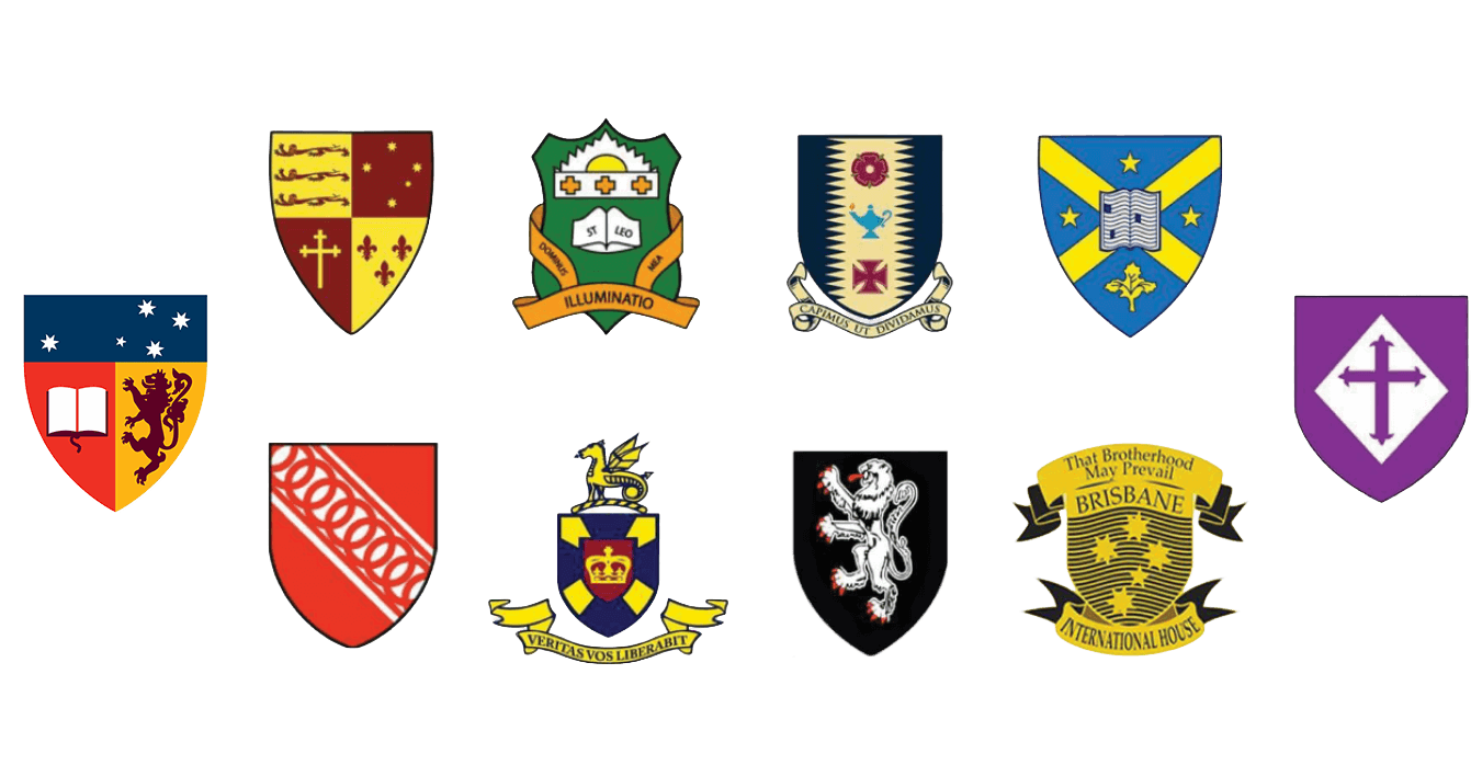
The college crests featured are based on those in use during our 2023 competitor review.
The challenge: could the consequence of tradition meld with the spirit of innovation to light a path forward?
Join us as we take you on a journey from the project’s beginnings in early 2023 through to the launch of our new visual identity in late 2025.
At the same time, the existing brand toolkit was showing its age.
It offered limited flexibility to build upon the College’s traditions or to connect meaningfully with a digitally native audience.
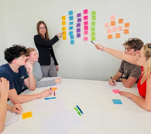
Students, staff, alumni and parents participated in focus groups that confirmed what many expected: Emmanuel’s reputation is strong, brand equity is high, and our community shares a deep emotional connection to the College.
Stephen Peake,
Principal and CEO, Emmanuel College, 2025
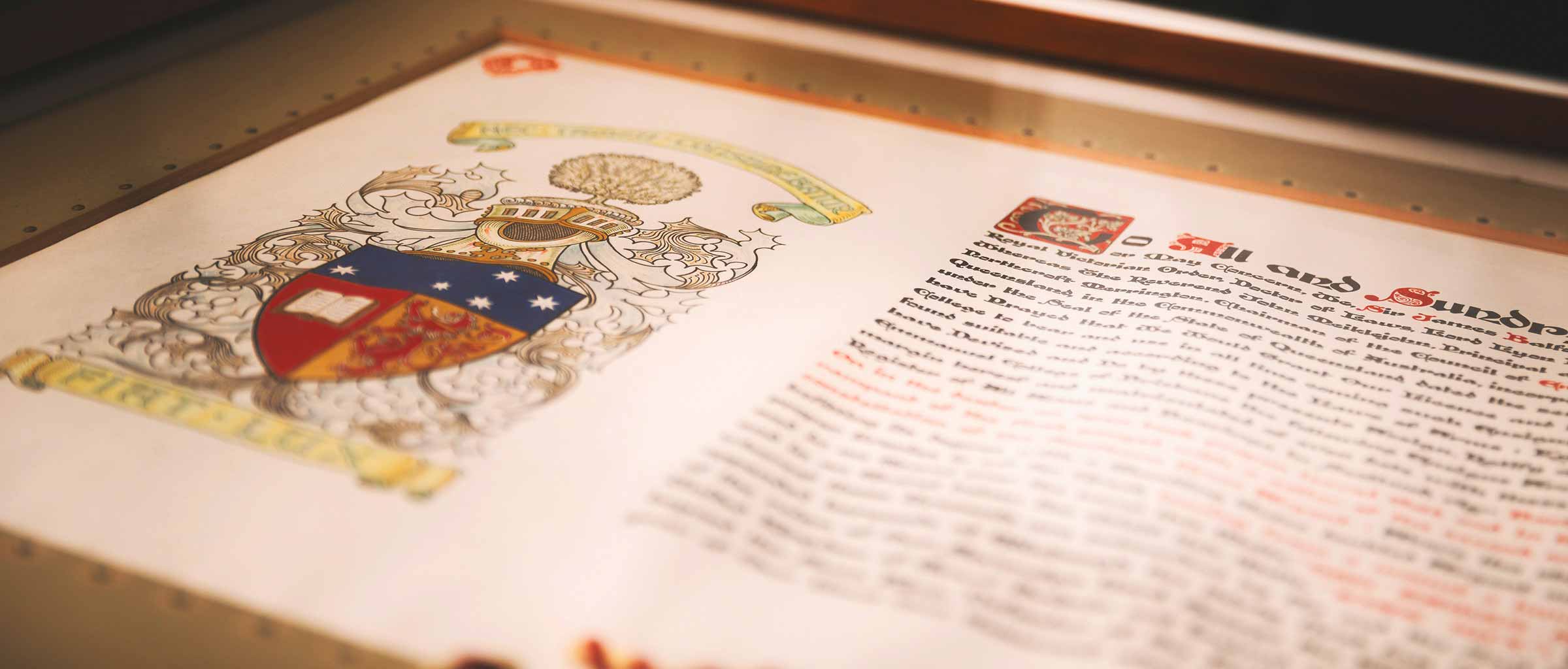
Emmanuel College is the only institution in Australia to receive its Ensigns Armorial from the office of the Lord Lyon, King of Arms, Edinburgh, the oldest heraldic office in the world.
The opportunity was grasped to create a brandmark — crest and logotype — that strikes a careful balance between a progressive identity and one that respects and protects its heritage.
Diana Weeden,
Brand and Publications Lead, Emmanuel College, 2025
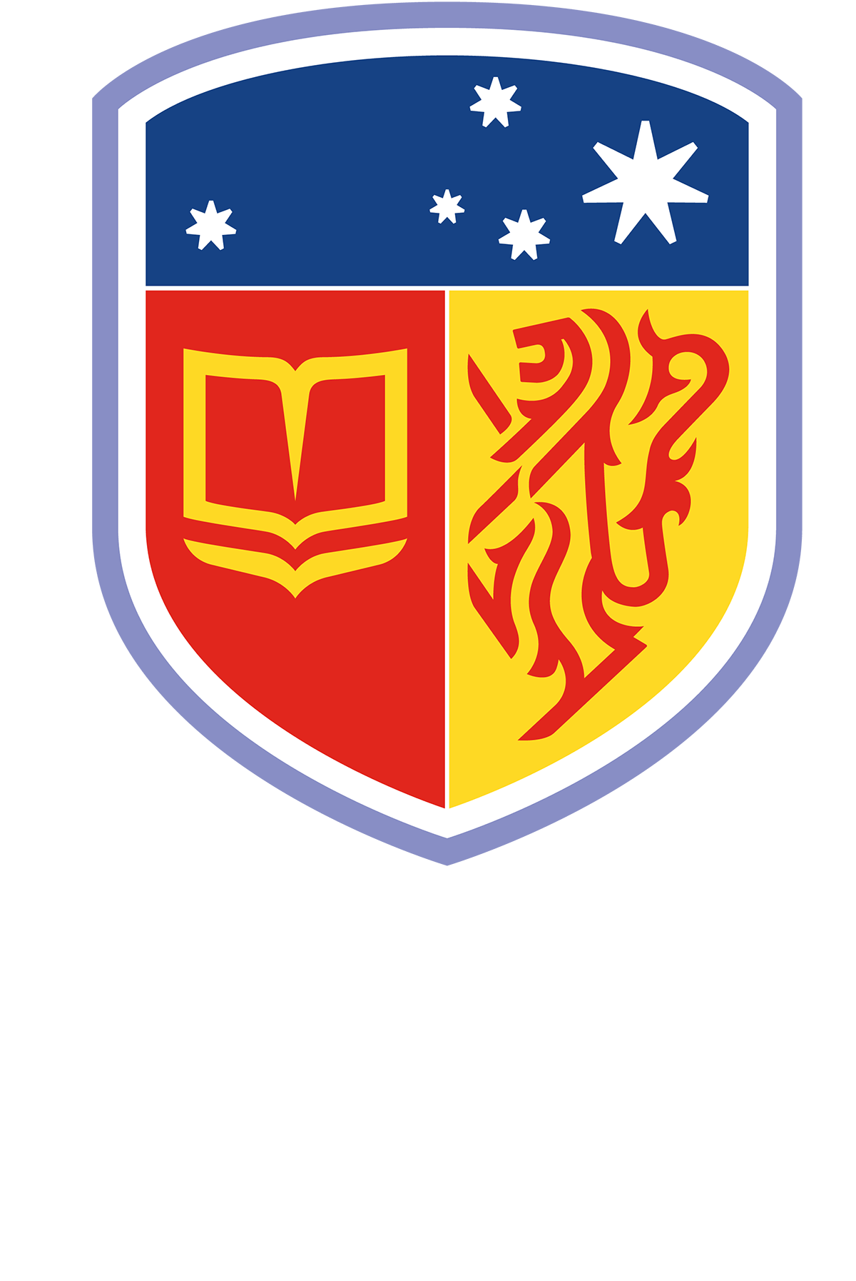
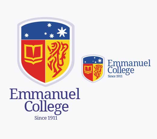
At the heart of this evolution is a cleaner, more contemporary crest, incorporating icons inspired by our original shield.
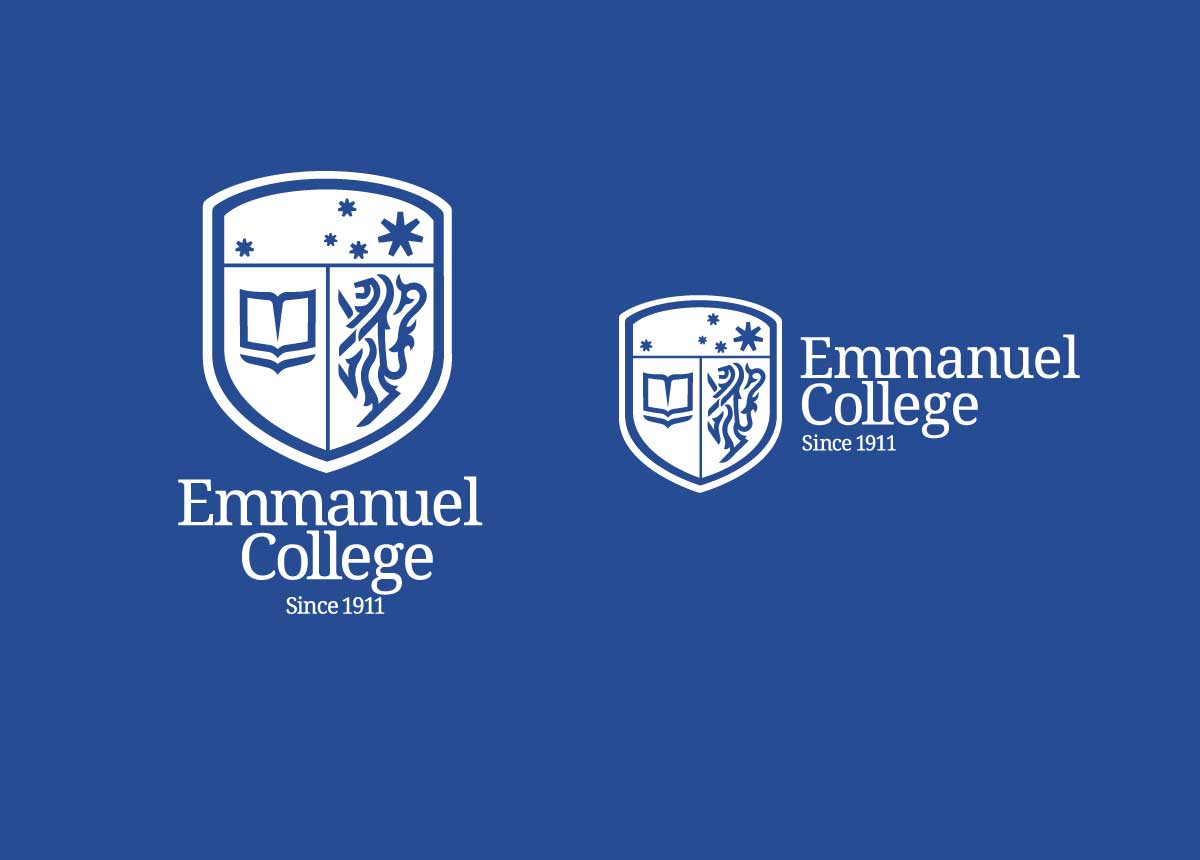

The open book symbolises the pursuit of knowledge and the wisdom handed down through generations. The lion reflects courage, strength, and nobility, echoing both the Royal Banner of Scotland and Emmanuel College, Cambridge. The stars complete the story, representing the Southern Cross and anchoring the College firmly in its southern hemisphere home.


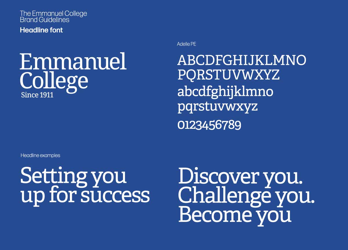
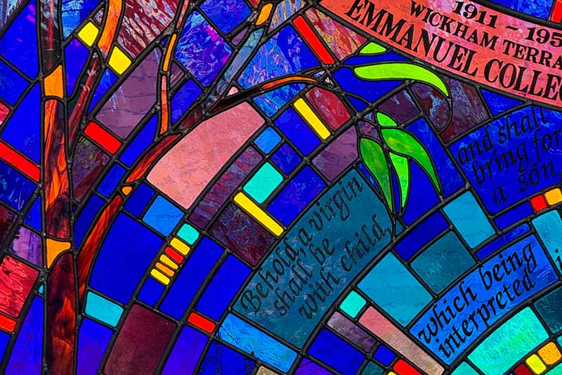
The visual language draws deeply from our motto, Fiat Lux or “Let there be light”, and the stained-glass windows of our chapel. These windows, rich in symbolism and colour, represent our heritage, community and academic excellence.


Our brand’s tone of voice has also been codified. Warm and optimistic, there is excitement in how we present ourselves through our words. We are respectful, reassuring and exhibit a quiet confidence.
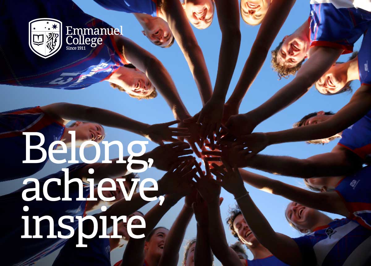
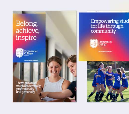
We have defined a fresh approach to the way we present the College in our photography and videography. The goal is to reflect the essence of campus life through the lens, focusing on real, genuine moments that tell the story of our community with energy and authenticity.
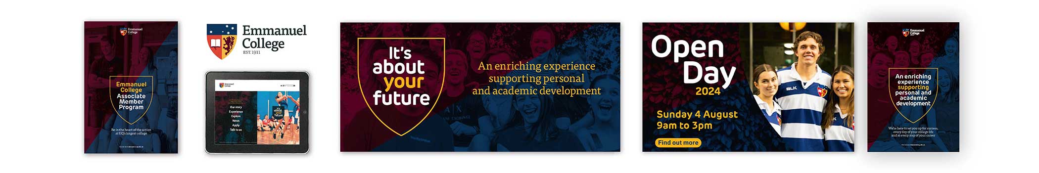
In a crowded and competitive environment, Emmanuel College has revitalised its brand with a fresh, modern identity designed to stand out and connect with today’s audiences.


Jack Thatcher,
3rd year resident, ECSC Secretary, 2025
Annabelle Hill,
Sports convenor, ECSC, 2024

A colourful discovery
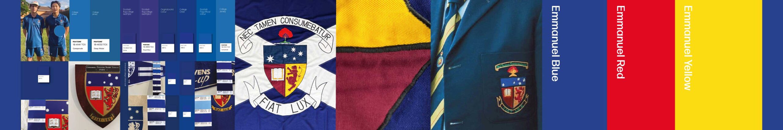
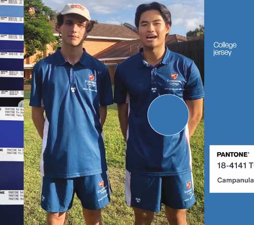
A brand review began after discovering several inconsistent shades of ‘Emmanuel blue’ in use across a number of brand assets, revealing deeper issues with identity and an outdated brand toolkit.

The Blue Dog pause
The brand review paused to revitalise ECSC’s Blue Dog branding, with co-design sessions leading to a unified design and usage guidelines to strengthen identity and recognition.
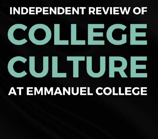
Culture as catalyst
A Culture Review engaged the College community, resulting in recommendations to strengthen identity, inclusivity, and alignment between values and brand.

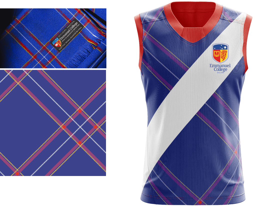
Weaving tradition into team spirit
In consultation with the ECSC Sports convenors a redesign of ICC sports uniforms embraced Emmanuel’s official tartan, merging tradition with contemporary style to foster pride, unity, and identity.
Conversations with community
Conversations with our community resumed through focus groups and consultative sessions, offering invaluable feedback on visual appeal, symbolism, adaptability, and the alignment of design directions with the College’s values.
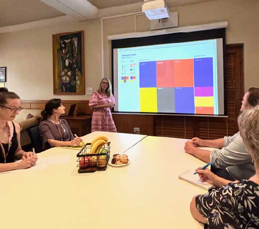
Designing for the future
Brand elements including marks, colour palettes, typography, and visual language were explored and shared with leadership and the community, with inclusive, community-led feedback guiding the preferred design direction for the new Emmanuel College brand.
Board approval
In consultation with the Board, the preferred brand direction was approved, marking the beginning of the new Emmanuel identity taking shape.
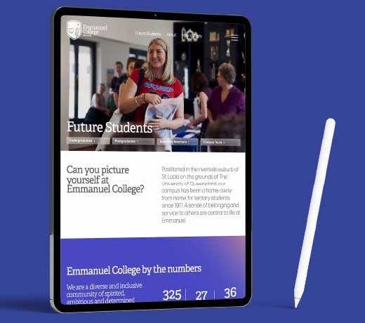
Digital first
Website redevelopment began, shaped by student and alumni input through focus groups and card sorting, resulting in a scoped plan aligned with the new brand and digital needs.
Finding our voice
A verbal brand review shaped a new tone of voice, positioning and key messaging guided by stakeholder input and customer personas.
The launch
Emmanuel’s new brand identity is officially launched, with the website as the first asset delivered and a phased rollout of digital and print materials scheduled through 2025–2026.
Stephen Peake,
Principal and CEO, Emmanuel College, 2025
Graham Purnell,
Creative Director Purnell Branding, 2025